
stitch야 디자인 개선해줘
웹디자인에 대한 오랜 트라우마가 있습니다
시삽, 웹마스터때부터 있던겁니다
그래서 이걸 극복해보고자 알아보던차에 tailwindCSS + daisyUI 가 좋다해서 시도해봤습니다
써보니 materialUI 보다 더 좋은줄은 모르겠네요
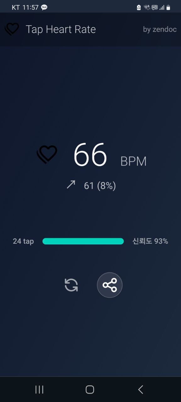
클로드 괴롭혀서 sveltekit tailwindcss daisyui 로 억지로 만들었는데 그야말로 처참합니다
예쁘고 멋진건 고사하고 기능적으로도 잘 안보이고 쓰기 힘들며, 보기 싫을정도로 못났네요
https://stitch.withgoogle.com/
그래서 stitch한테 개선을 부탁했습니다
나
https://taphr.vercel.app/ make it more comfortable, professional like
스티치
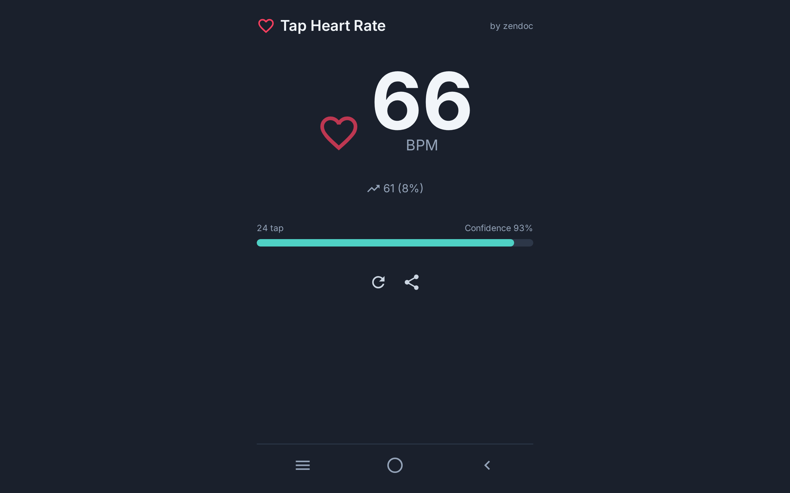
The design has been generated:
The app interface for "Tap Heart Rate" features a dark theme with a central display of heart rate in BPM, accompanied by confidence percentage and options to refresh or share.
Do you need any changes or further refinement on this design?
나
make it light theme and red color shouldnt be used cause it can provoke humans heartbeating
스티치
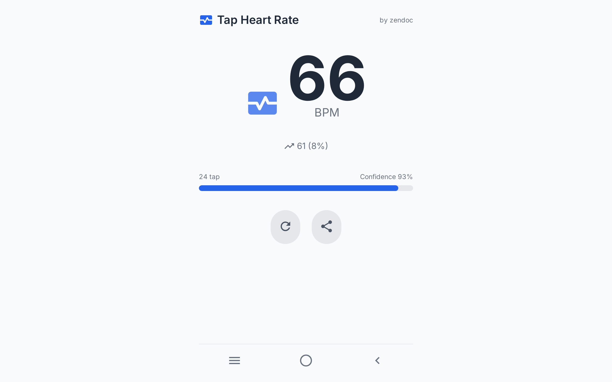
The "Tap Heart Rate" app interface has been updated to a light theme, replacing red with a more neutral color to avoid any subconscious associations with increased heart rate.
Would you like to explore additional adjustments or details on this refreshed design?
좀 더 가다듬을 여지는 있어보입니다. 그래도 색상, 구도, 폰트는 real world professional 하게 바로 잡아준 것 같습니다
어때요? 쓸만해보입니까?
로고, favicon, launcher icon 이 너무 엉성한데 반성하고 아이콘 사이트 몇개 찾아놨습니다
예뻐지고 싶습니다
